Mangahigh is a UK based Maths Games Edtech company with products used by more than 5.000 schools and education departments all around the world.
Mangahigh’s main product ‘Teacher Experience’ is the gateway platform through which the core users – teachers from all around the world – assign activities and games to their students and follow their progress.
Teacher Experience was made almost ten years now with many designers involved that came and went.
As Product Designer, I worked directly with the VP of Product, Developers and other designers.
It was my responsibility for this project to make improvements on many issues the product had been carrying for many years.
Project Proposal
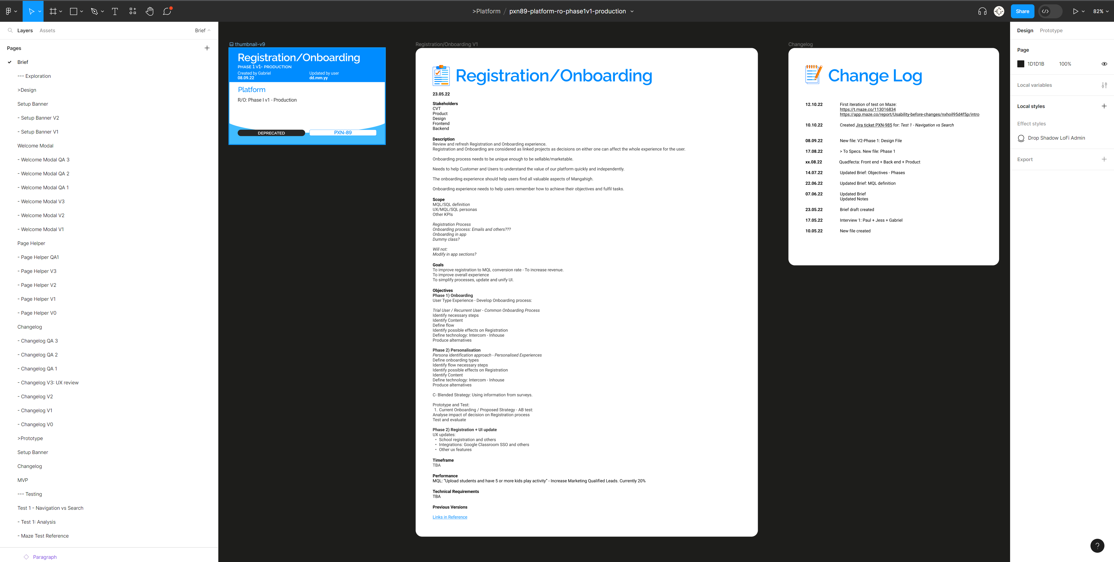
This document is a summary of the strategy presented to tackle the problems presented in the brief.
The original brief provided for this project including revisiting two main aspects of Teacher Experience:
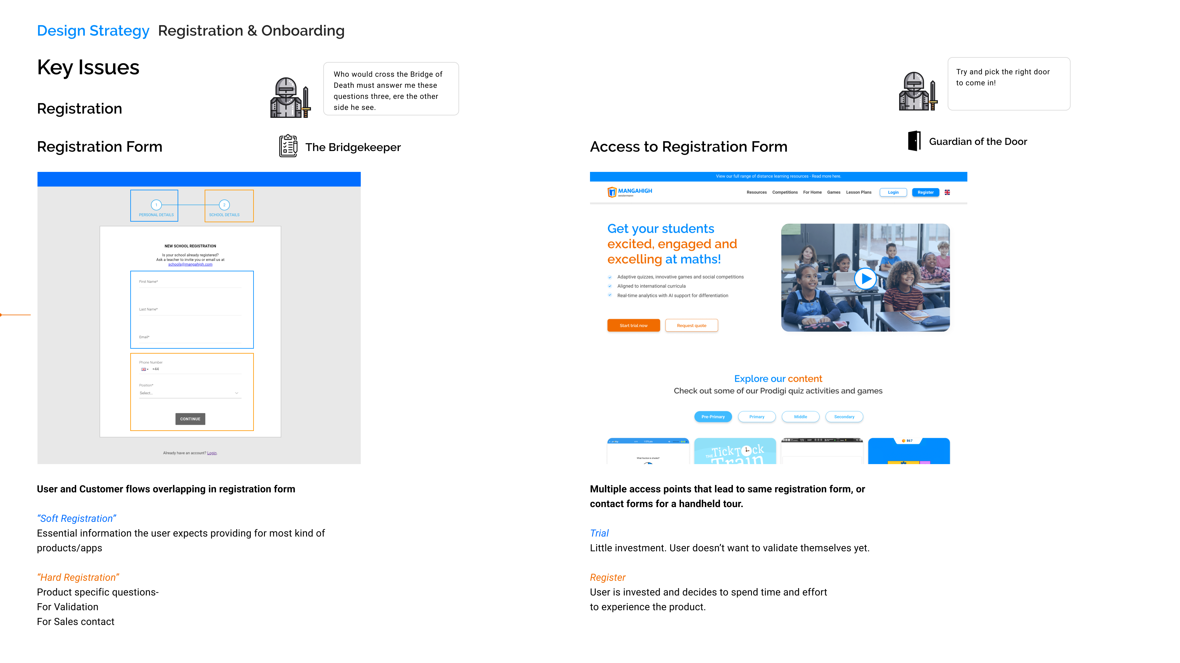
Registration and Onboarding
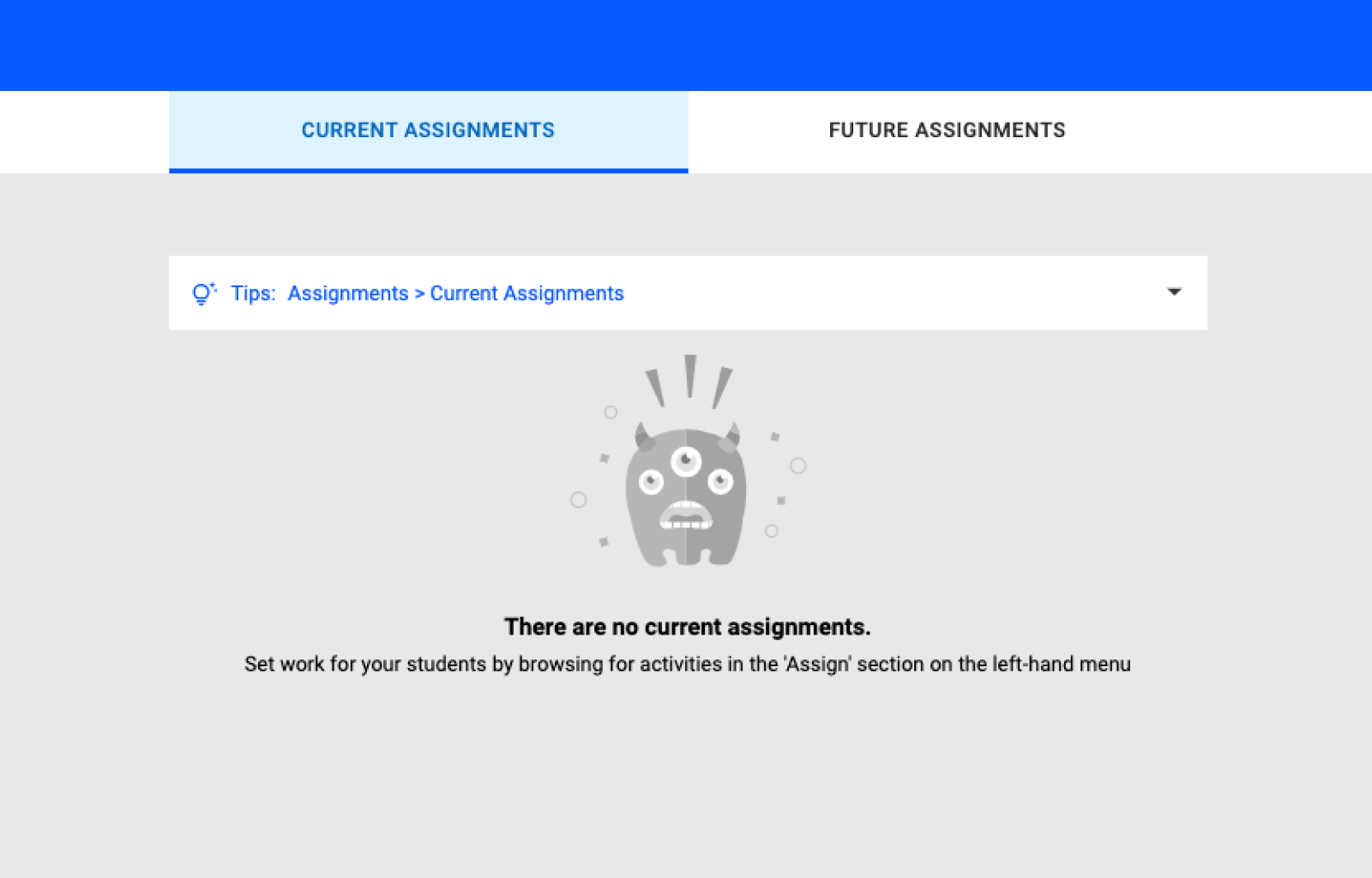
Mangahigh’s Teacher Experience doesn’t provide any in-app intuitive onboarding features. So far, printed guides and emails triggered by user behavior are the only tools it counts with to explain how to use the product, and succeed at the many tasks: Setting up your classes, Assigning them activities and Analysing student’s reports.
This situation triggered a complete review of the Teacher Experience UX and UI that will be explained further in the project.
MQL: Marketing Qualified Leads
This KPI is used internally to measure when trial users will be invested in the future to acquire the product long term, and it was set up many years ago using as a trigger users setting up at least one classroom and assigning activities to at least 5 students.
The MQL KPI trigger event was understood to be insufficient and misleading. Further splitting of this KPI into smaller KPIS, to transition from MQL to SQL were suggested and investigated during the project.
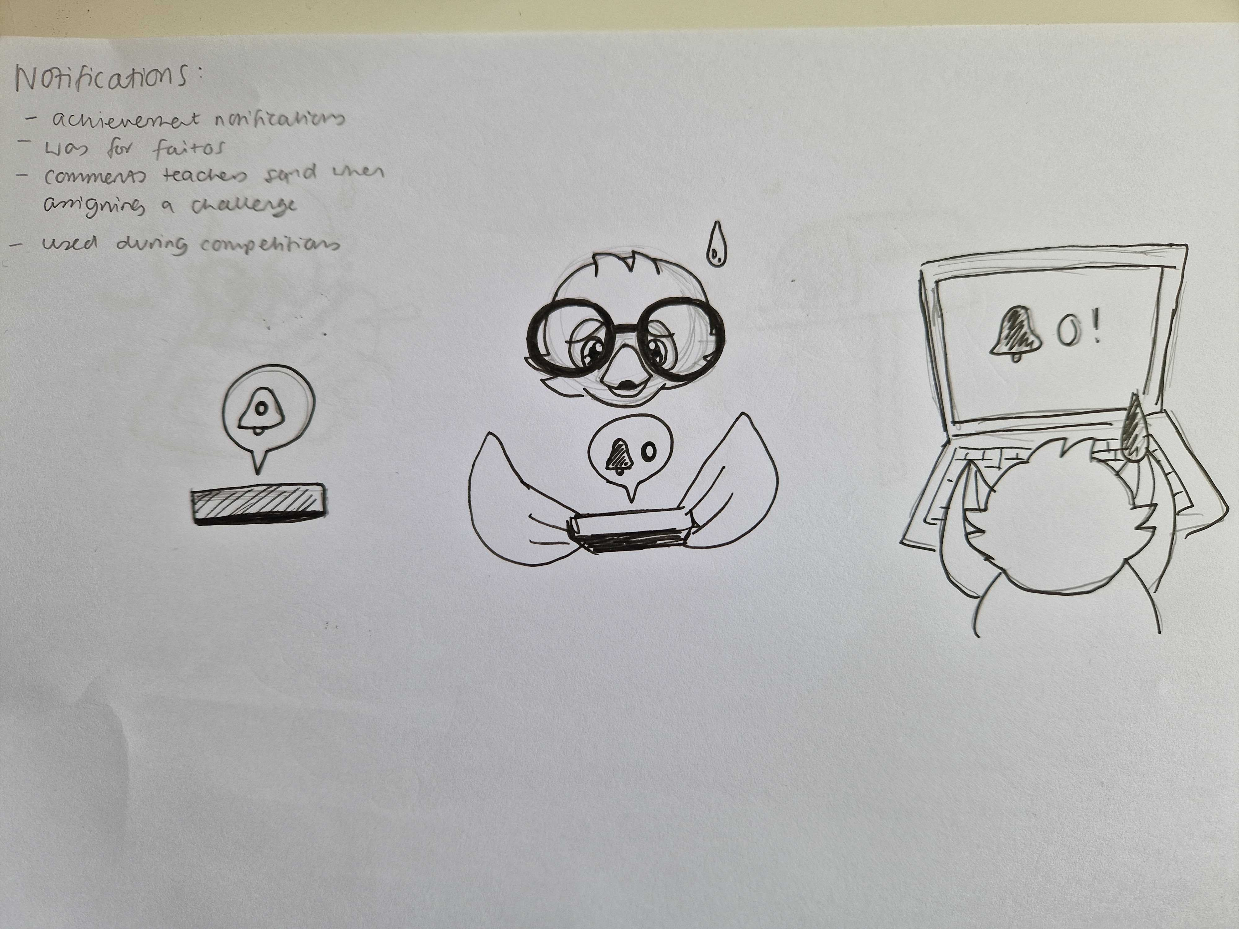
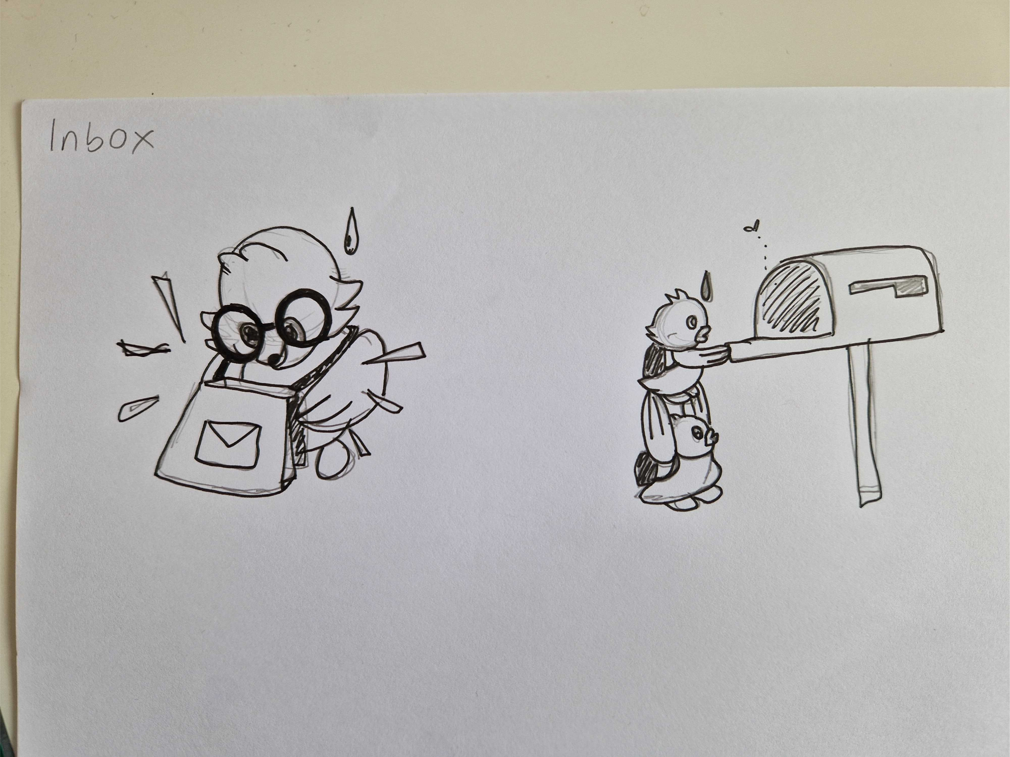
Lottie Animations
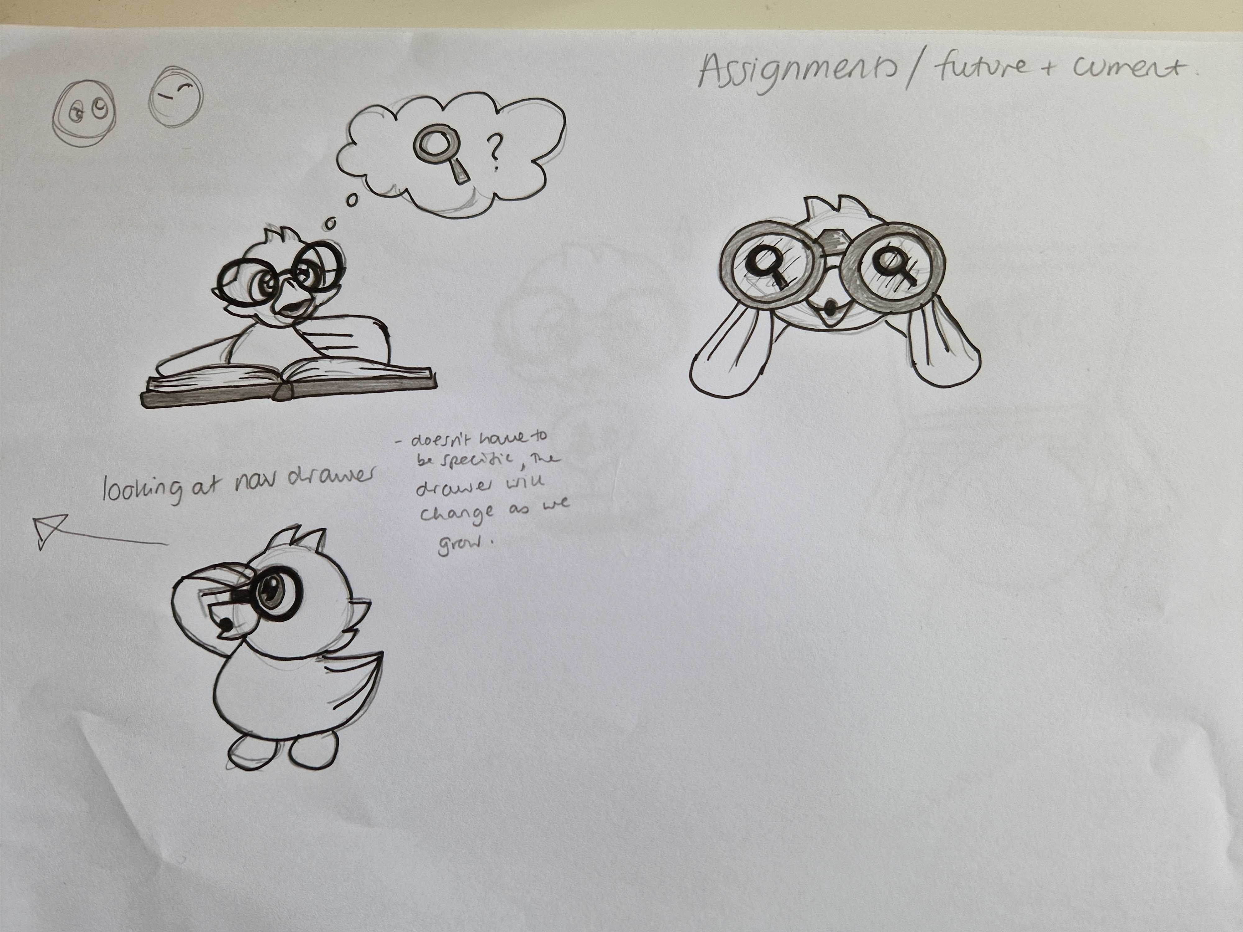
A set of branded animated characters was developed for this project, as a first step to refresh the current brand.
Research Results
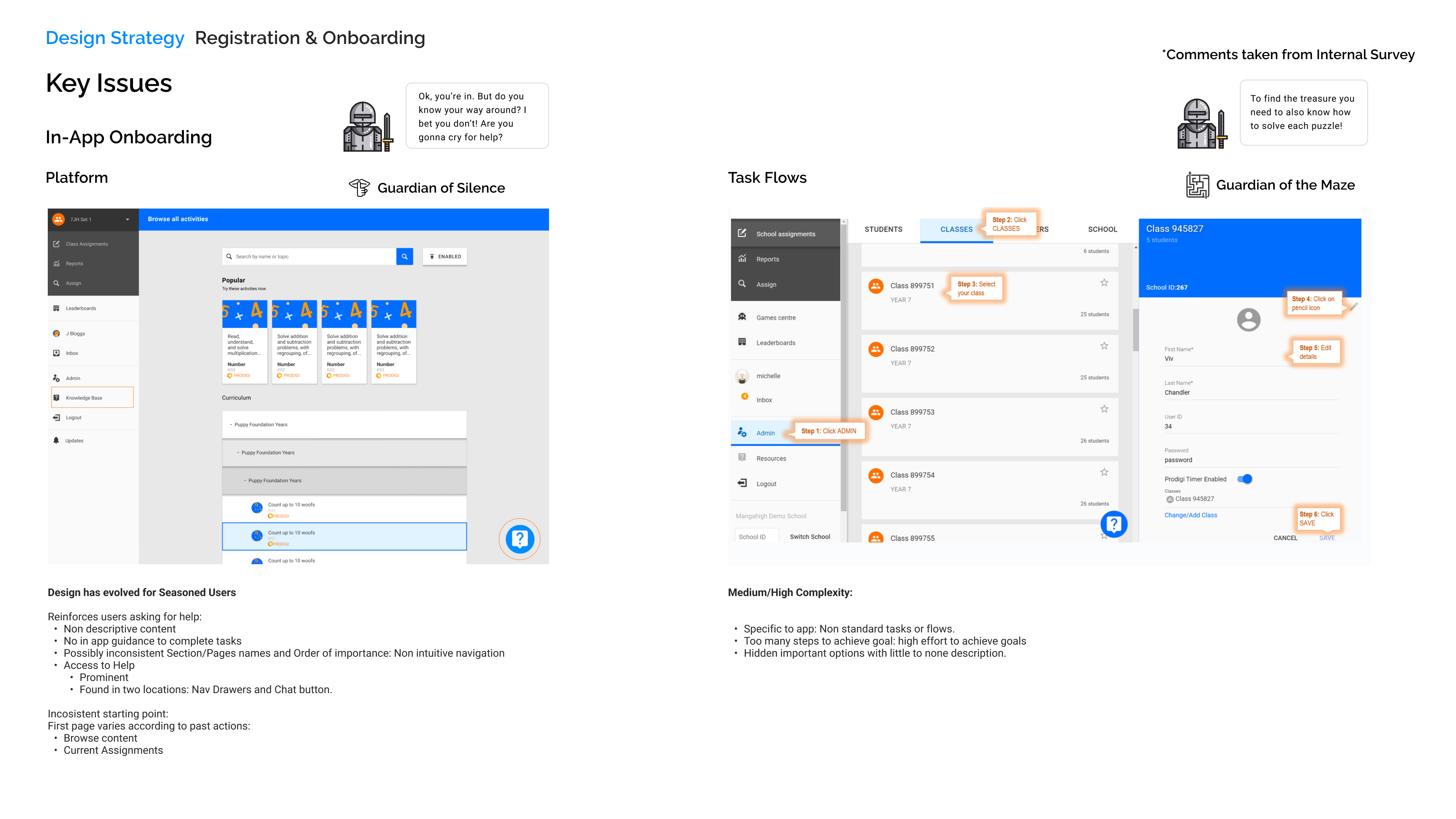
The Teacher Experience product evolved to become catered only for Seasoned Users. Trial Users and newcomers struggle signing up and learning how to navigate the product.
Revision of the complete user journey through Mangahigh
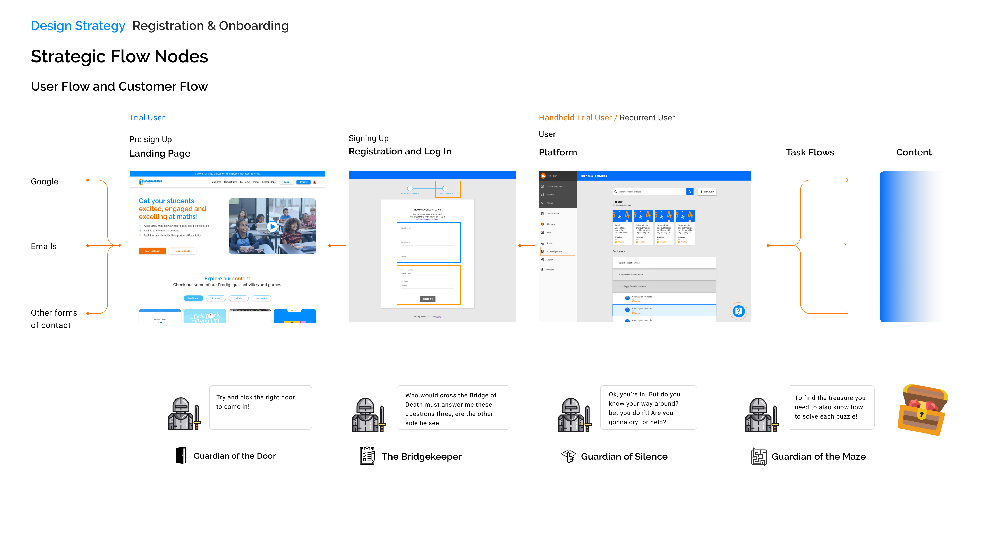
The User Journery was studied from the first moment users and customers find us by using search engines, as they visit the company’s website, sign up or log in, and use the Teacher Experience product.
The codename of the strategy devised after the research analysis has to do with the UX maturity of the company. It was understood it was necessary at this stage to backtrack into past efforts to identify our personas, and analyse our user’s behaviours according to their user types:
From this hypothesis, it was understood that the product in its current estate has evolved to cater mostly for Seasoned Users due to lack of in-app features that could help a Trial User, or a new user navigate the product.
This same reason was understood as potentially affecting MQL conversion rates, as the current KPI expected a very specific behaviour from users: Setting up a class, and assigning them 5 activities.
This behaviour demanded from the user a high degree of expertise in using the product.
At the same time, the only tools provided for users to learn how to navigate the product were:
Survey Report
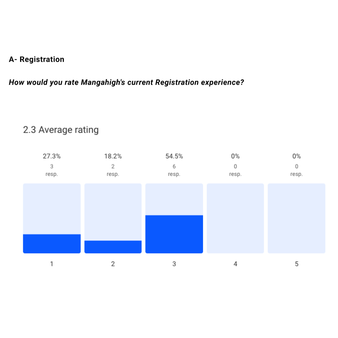
An external survey with more than 70 participants was ran between seasoned teachers and trial users. This provided meaningful insights on the state of the Registration and Onboarding process.
Interviews, Internal and External Survey Results
Both internal and external feedback show a low degree of satisfaction with the current Registration and Onboarding process and tools provided to users.
Interviews
Internal and external interviews with different stakeholders such as the VP of Product, Marketing Director, Sales Representatives from multiple regions and Quadfecta meetings with Backend and Frontend Developers, Project and Product Managers, and Teachers were held to clarify aspects of the brief and understand the problem from a bigger picture perspective.
VP of Product: “the ultimate goal is to make the journey for someone who sees MH for the first time to pay to use our product as simple and as painless as possible.”
Current user: “Teachers need to be able to get started fast, learn if they’re wasting their time or want to spend more time.”
Marketing Director: “Two things are essential – Understanding “the value of our platform Fast” and “Understanding the value of our platform independently” – Some people may need handholding and visits, but the user should be able to learn about how the platform works and what it has to offer autonomously
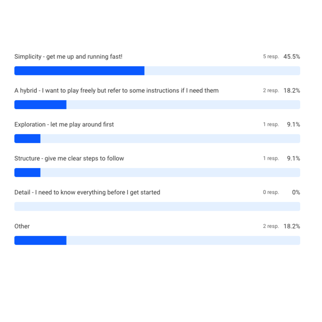
Internal and External Surveys
It was decided to run internal and external surveys to listen to our users understanding of their Registration and Onboarding experience with the product as well as learn more about their expectations according to other products they are used to interacting with.
Findings
After the Briefing stage and research were ready, first drafts of design ideas were quickly put to the test by prototyping on Figma and using Maze to run an A/B test among different types of users.
Methodology: A/B Test – Navigation Vs Search
The objective of the Navigation Vs. Search test is to find out if Trial Users actually know what the Teacher Experience product is for, and test how useful the information provided during the current onboarding process is. The objective is to find ways to reduce reliance on external sources (printed material) or contacting support for essential tasks.
Trial Users will be provided with access to the Mangahigh Homepage, as their resource to find out what the product allows and what it is about.
With this information, they will be asked to Create a Class and Add students.
A/B Test
A) Information about Mangahigh provided on Website
Users will be shown the current website and then given access to the product. Their main source of information about the product will be the current Homepage.
B) Website + Welcome Screen + Step Onboarding Screens (In-App)
Users will be provided with the Website and after Logging In, they will be shown a new Welcome Screen with a Three Step Onboarding sequence of screens.
Contact Us button will be present at all times.
If Users need to find more about how to navigate the platform by relying on the Contact Us button, it will be considered as a failed test.
Test Sample
KPIs
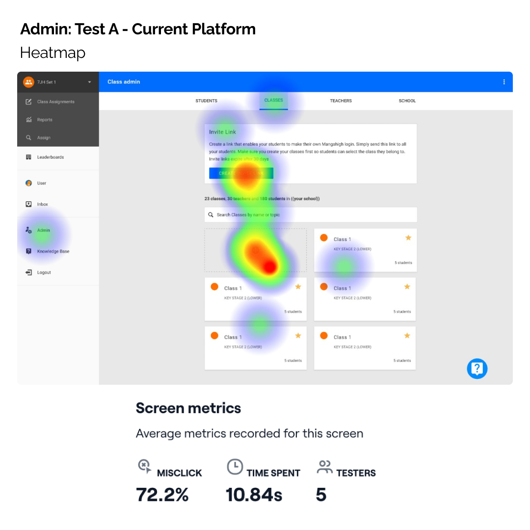
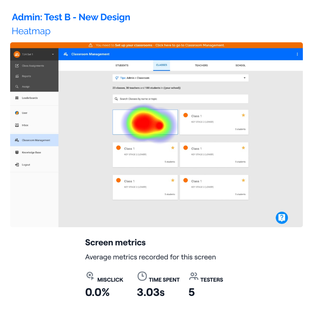
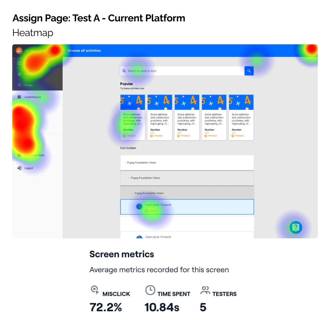
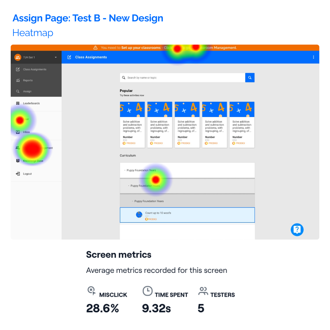
A/B Test Screen Comparison
By renaming sections in more intuitive ways and organising and restyling button hierarchies, multiple screens presented huge improvements in performance.
| KPIs | Test A: Current Platform | Test B: Implementing New Features |
|---|---|---|
|
Task Success Rate |
80% |
90% |
|
Time on Task |
66.9s |
29s |
|
Mis-click Rate |
55% |
33% |
Findings
Test results pointed out hierarchy issues in our Website design that created confusion between our users, as a big number of testers wouldn’t go past the Hero section, nor quickly find access to Log In or Sign Up buttons.
Once they were inside the product, without any type of in-app guidance, it was difficult for them to know how to navigate the product.
The second alternative, which provided a Welcome Screen with a Three Step Onboarding process, Tips on each page, and minor UI updates proved to lead to the right direction by:
Early testing of ideas gave the team a clearer direction about the success of selected UX patterns that would improve the Registration and Onboarding process.
+10% Increase
43% reduction
22%
reduction
Test and Prototype Results
Early testing of ideas gave the team a clearer understanding of how successful initially selected UX patterns would improve the Registration and Onboarding process.
Heatmaps were also extremely useful to visualise user behaviour and point out other hierarchy issues, both in the product and the website.
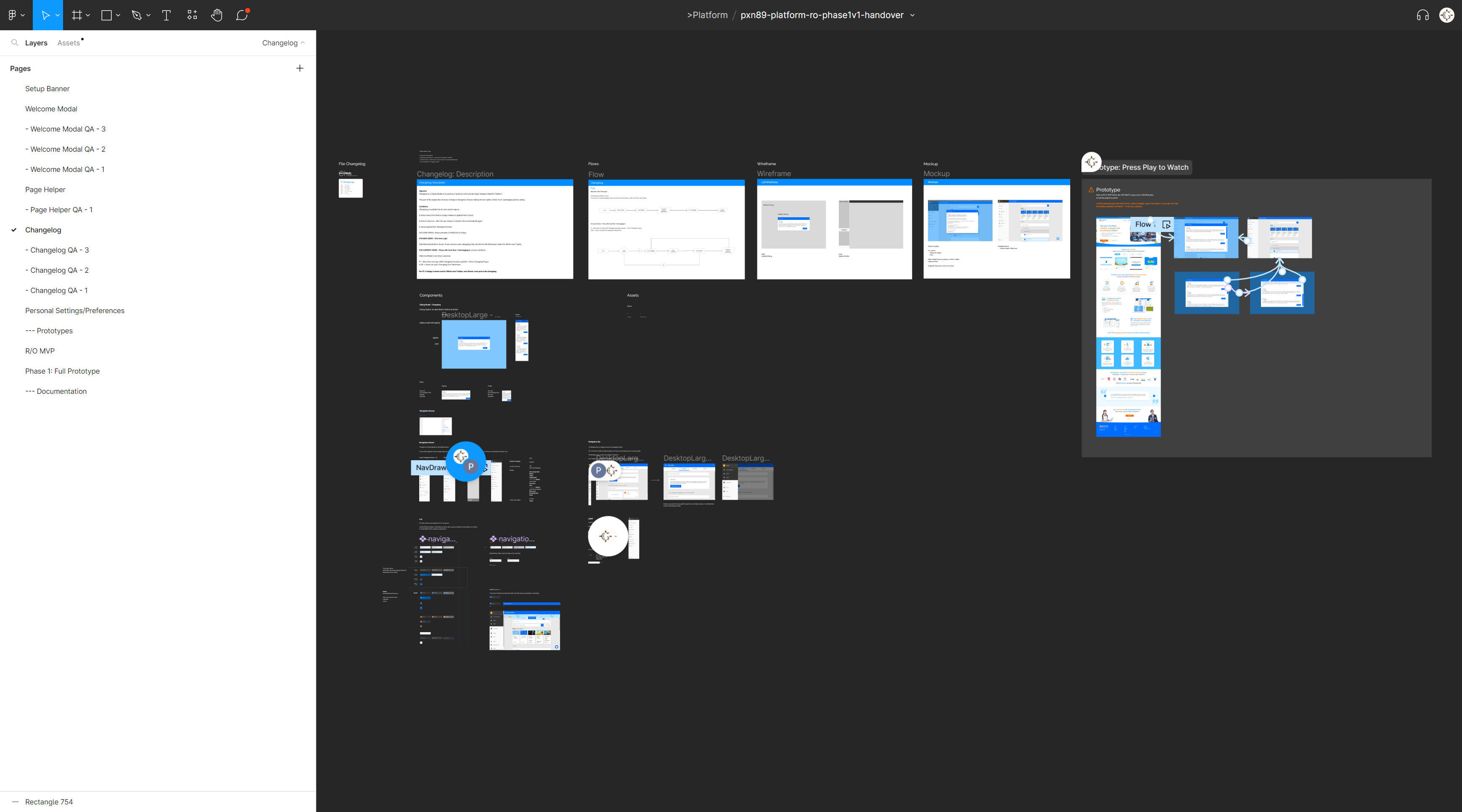
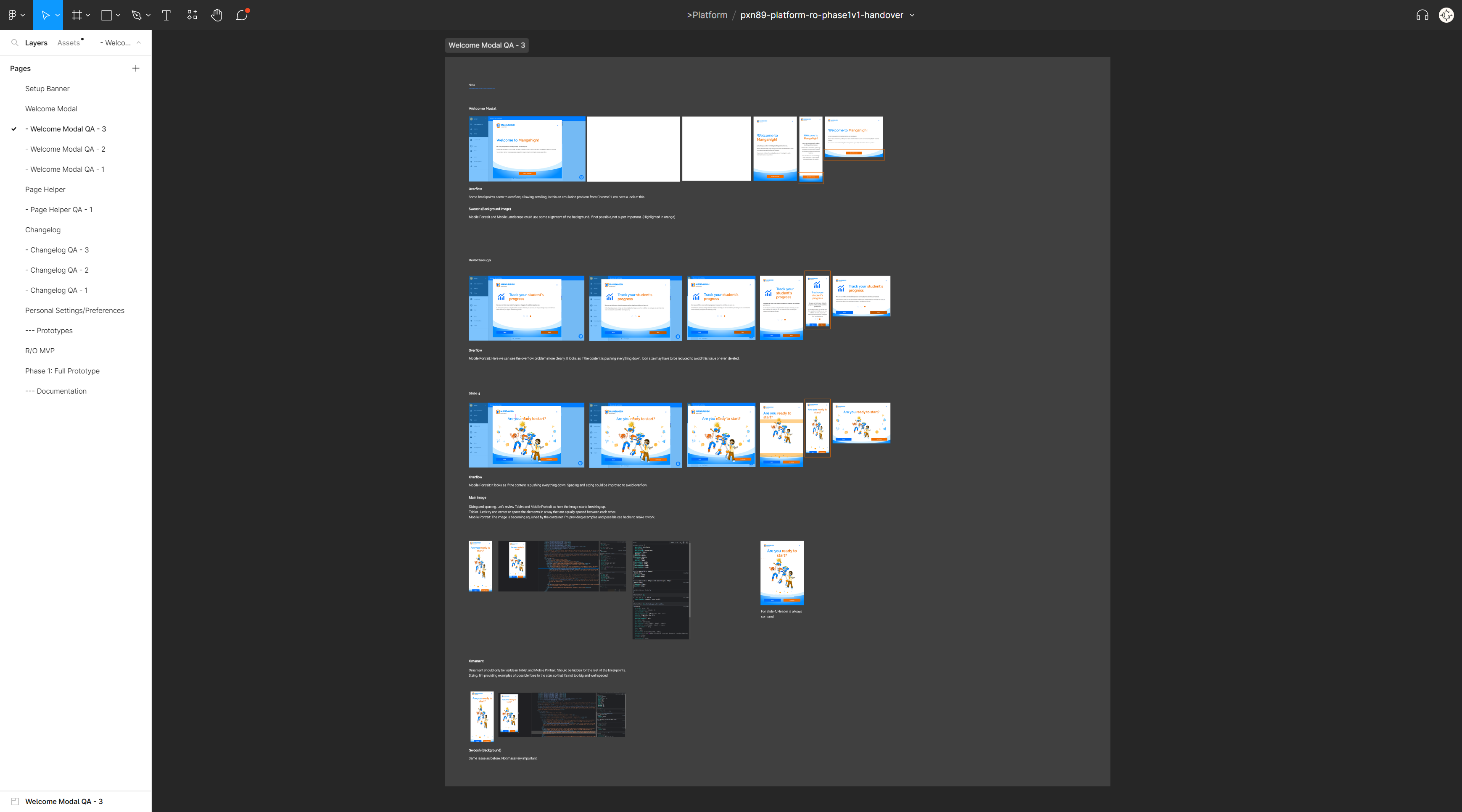
Specs, Flows, Wireframes and Mockups
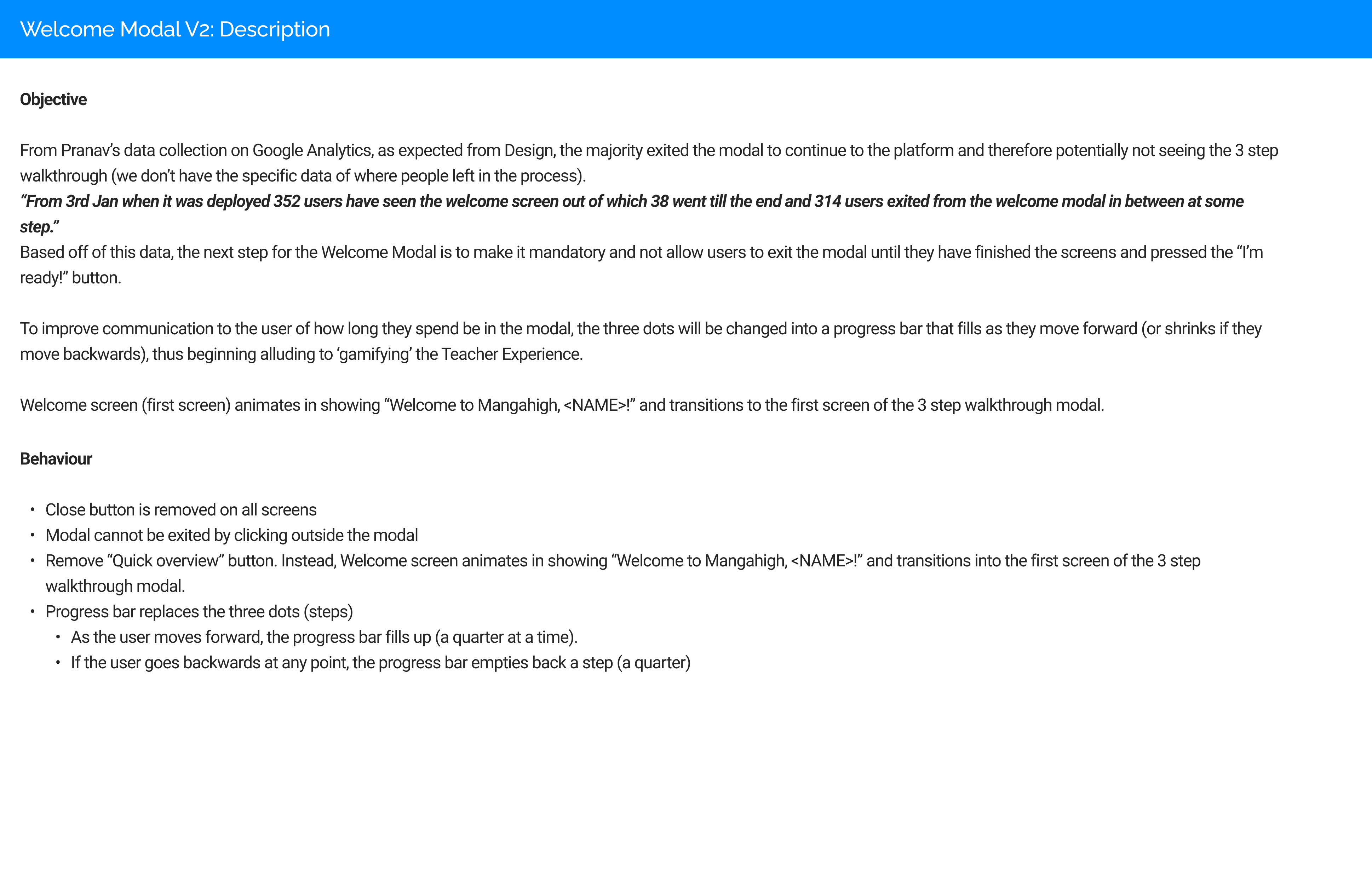
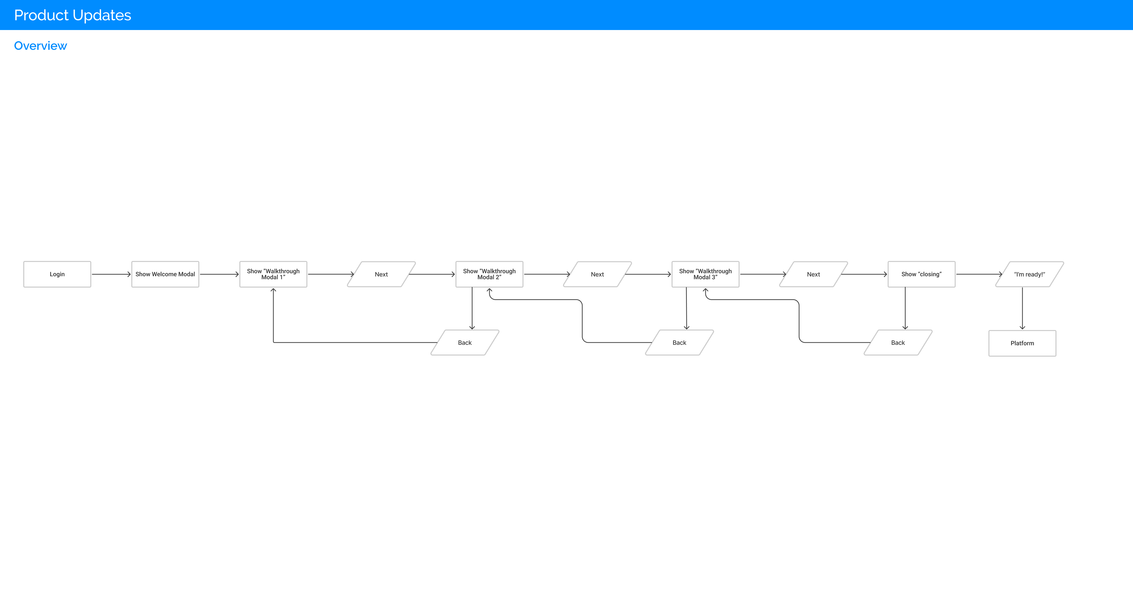
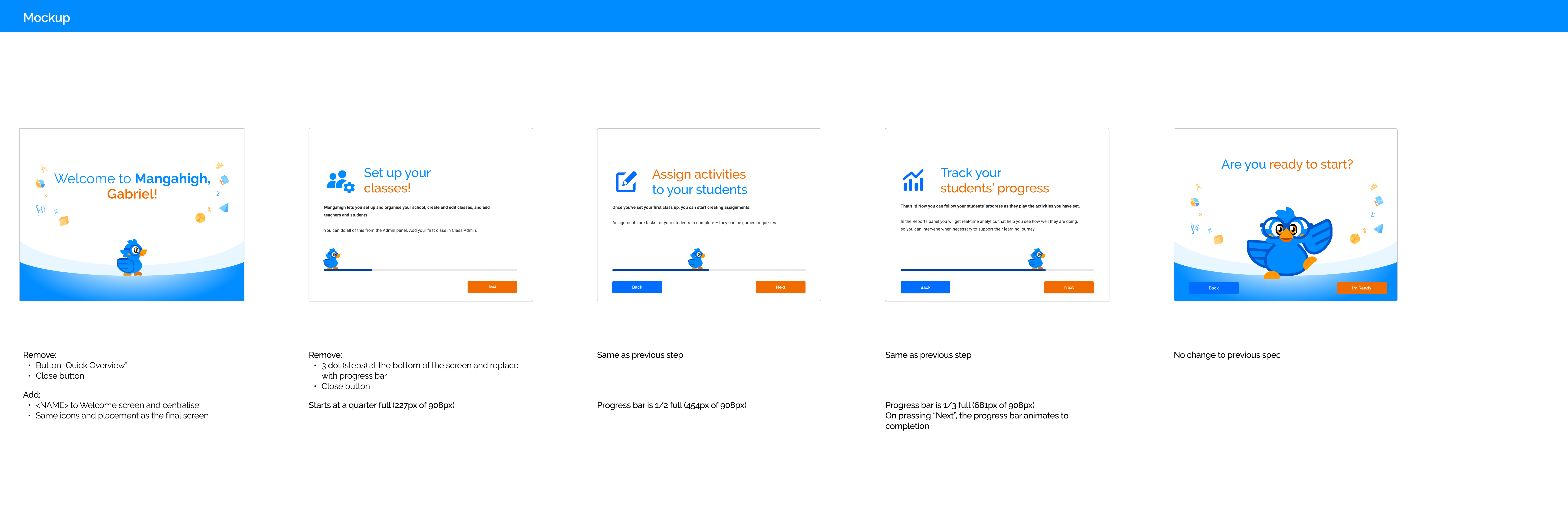
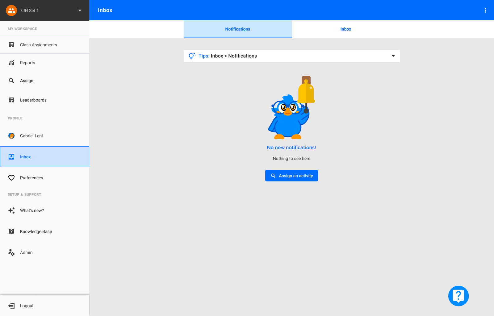
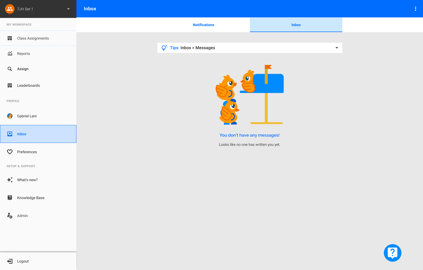
These introductory screens have the objective of providing new users with a quick overview of the main features and tasks available within the Teacher Experience.
The information provided by these three screens works as a reminder in case users simply wished to try out the product but had very little understanding about it beforehand.
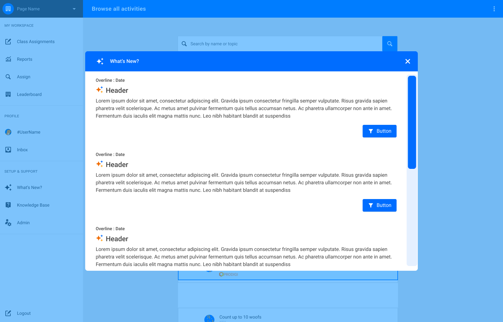
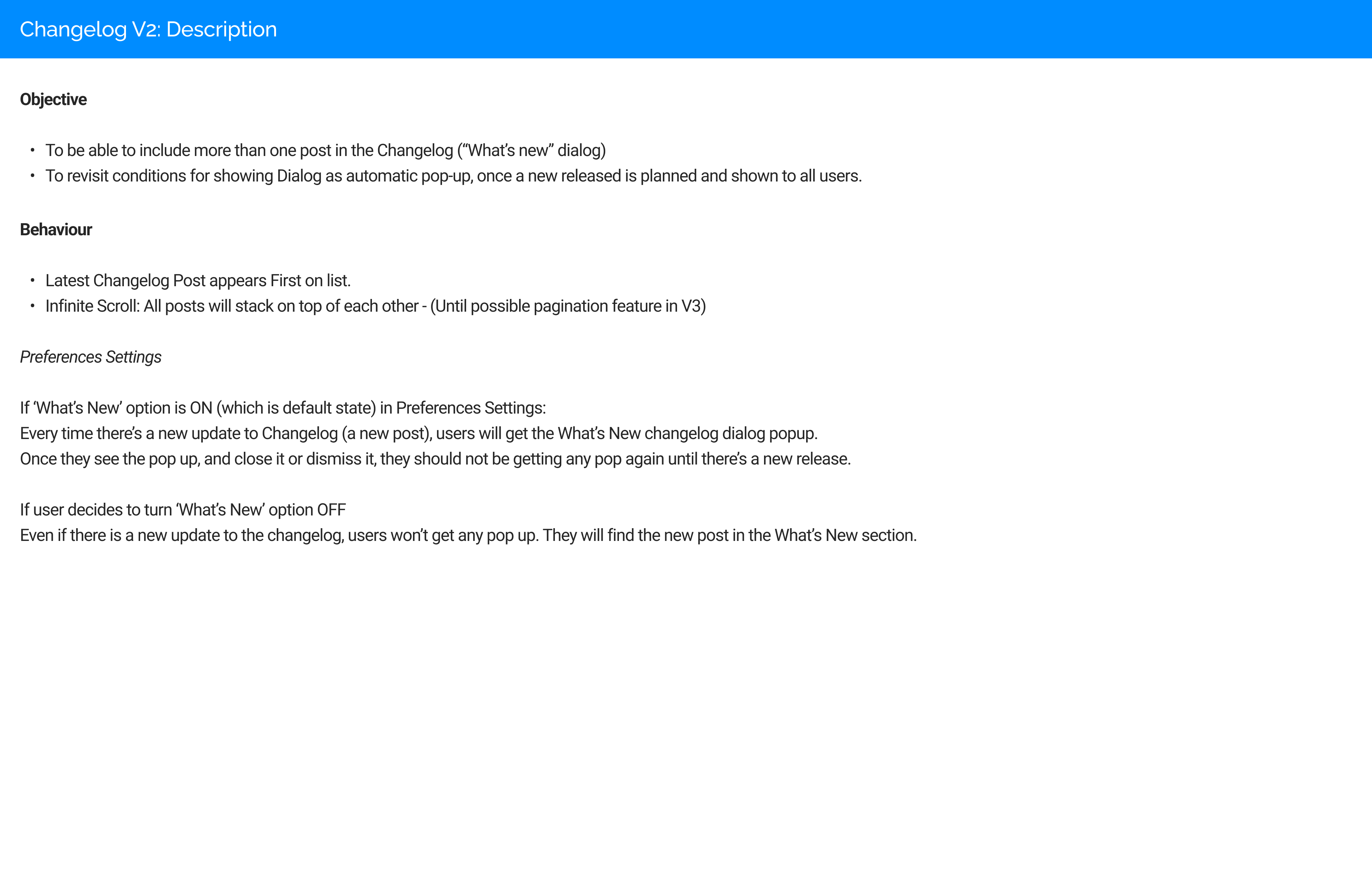
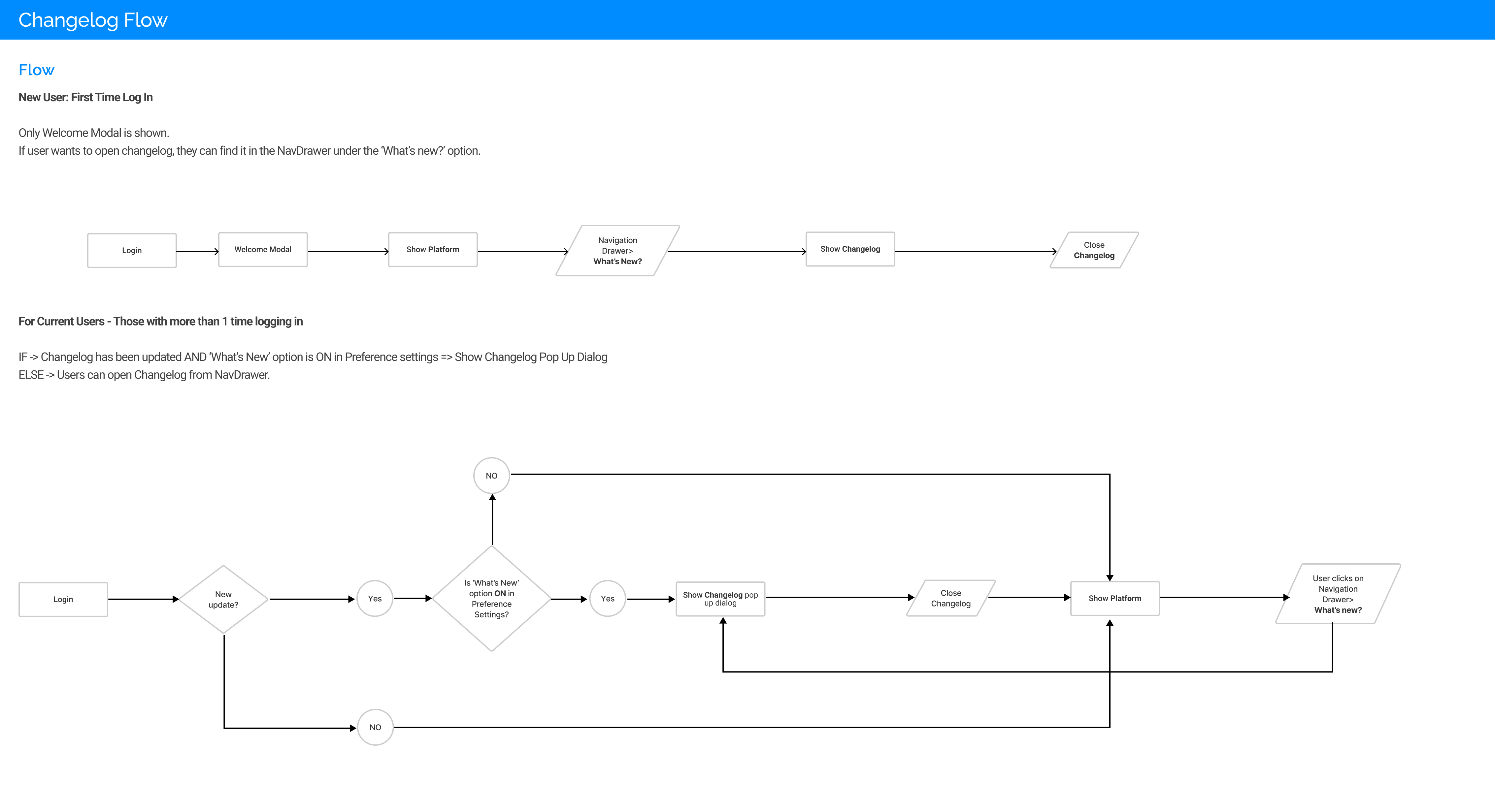
To start with, and to make sure any changes to the product are properly introduced to users, a new Changelog feature was implemented as part of this project.
Before this, any updates or changes would be presented via promotional e-mail, as there was no in-app option that would help users understand what was different in their interface or experience.
This measure was also designed with the objective of releasing next steps of the project in a progressive manner, and give time to users to adapt to changes and give them the option to send feedback.
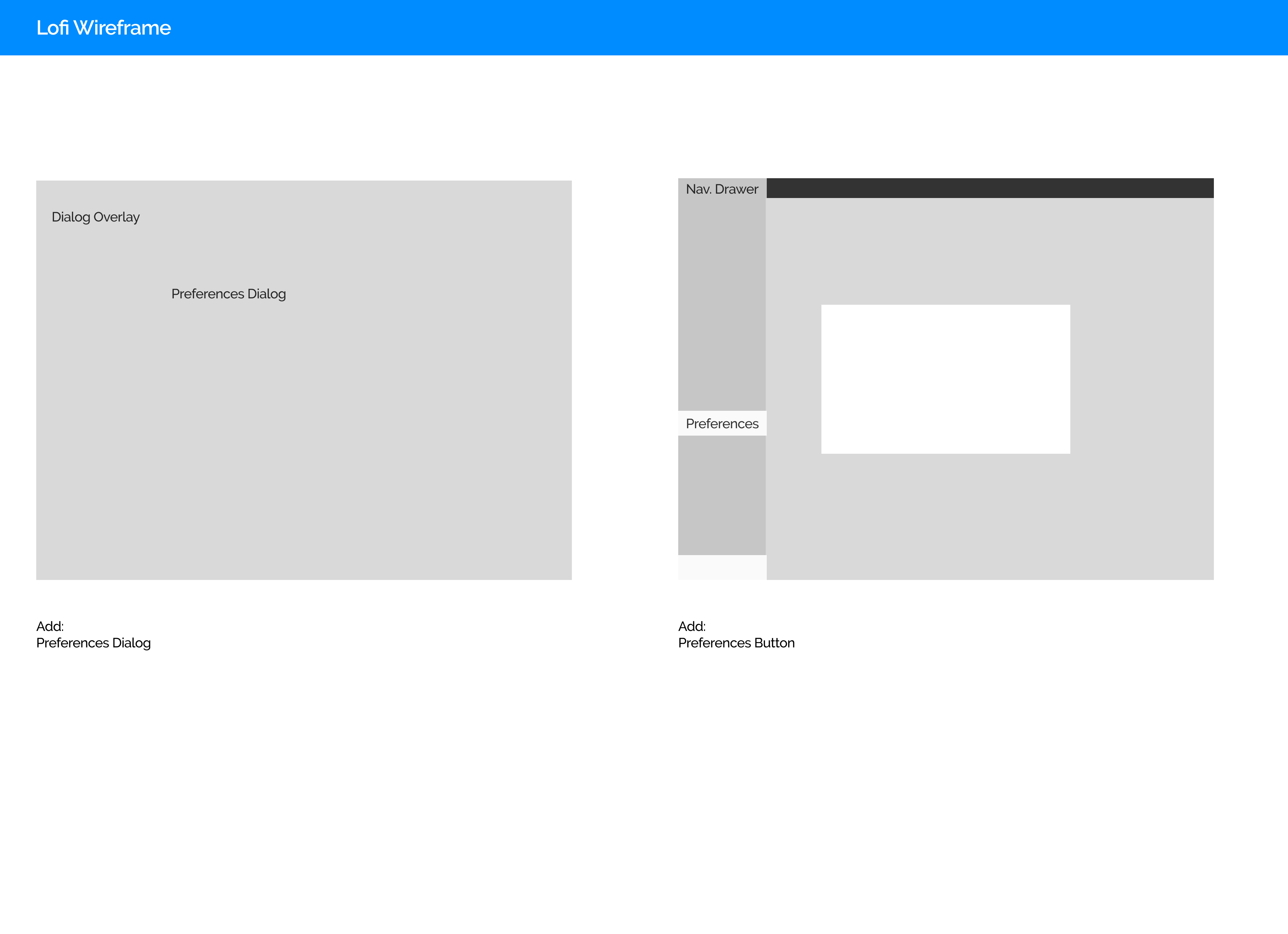
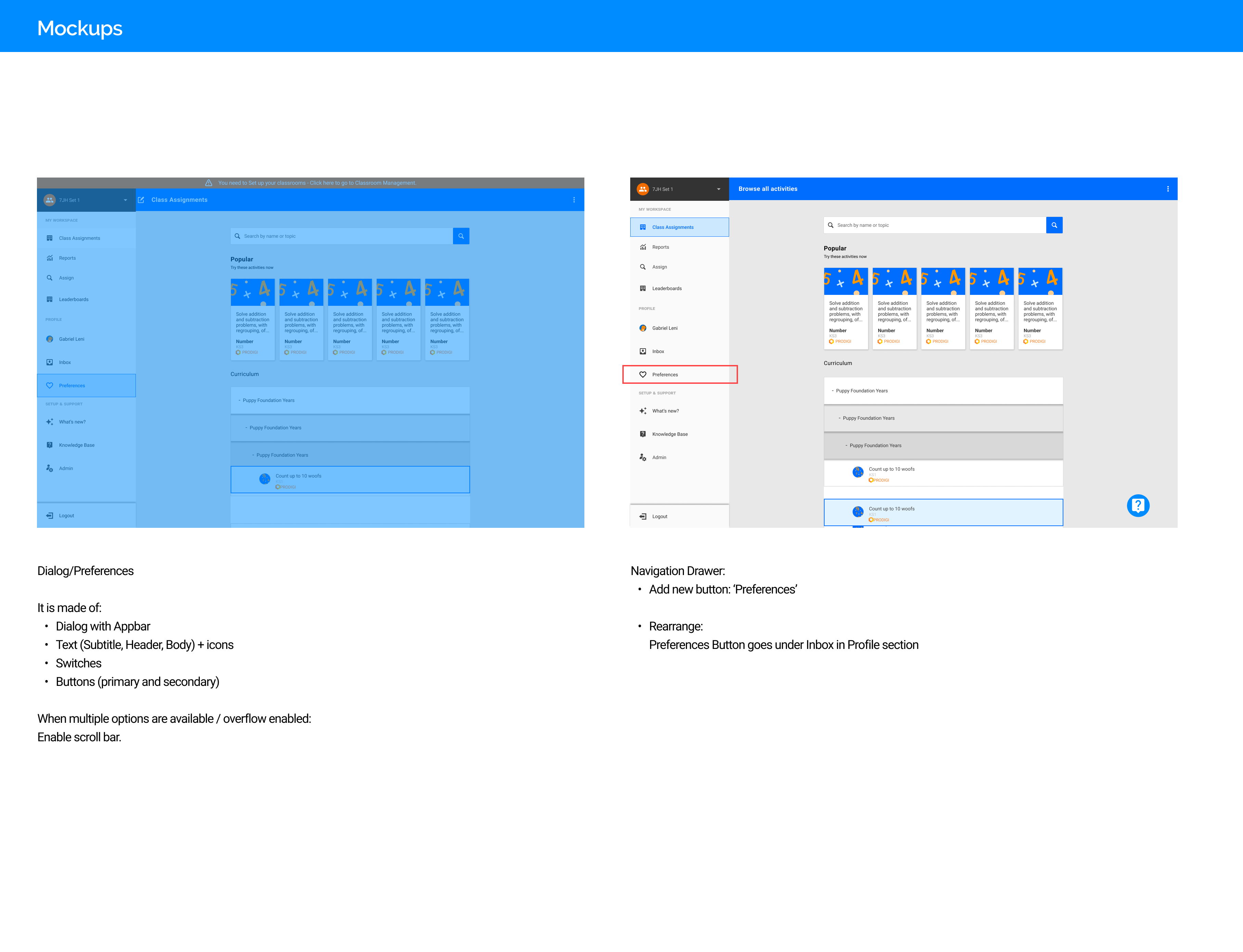
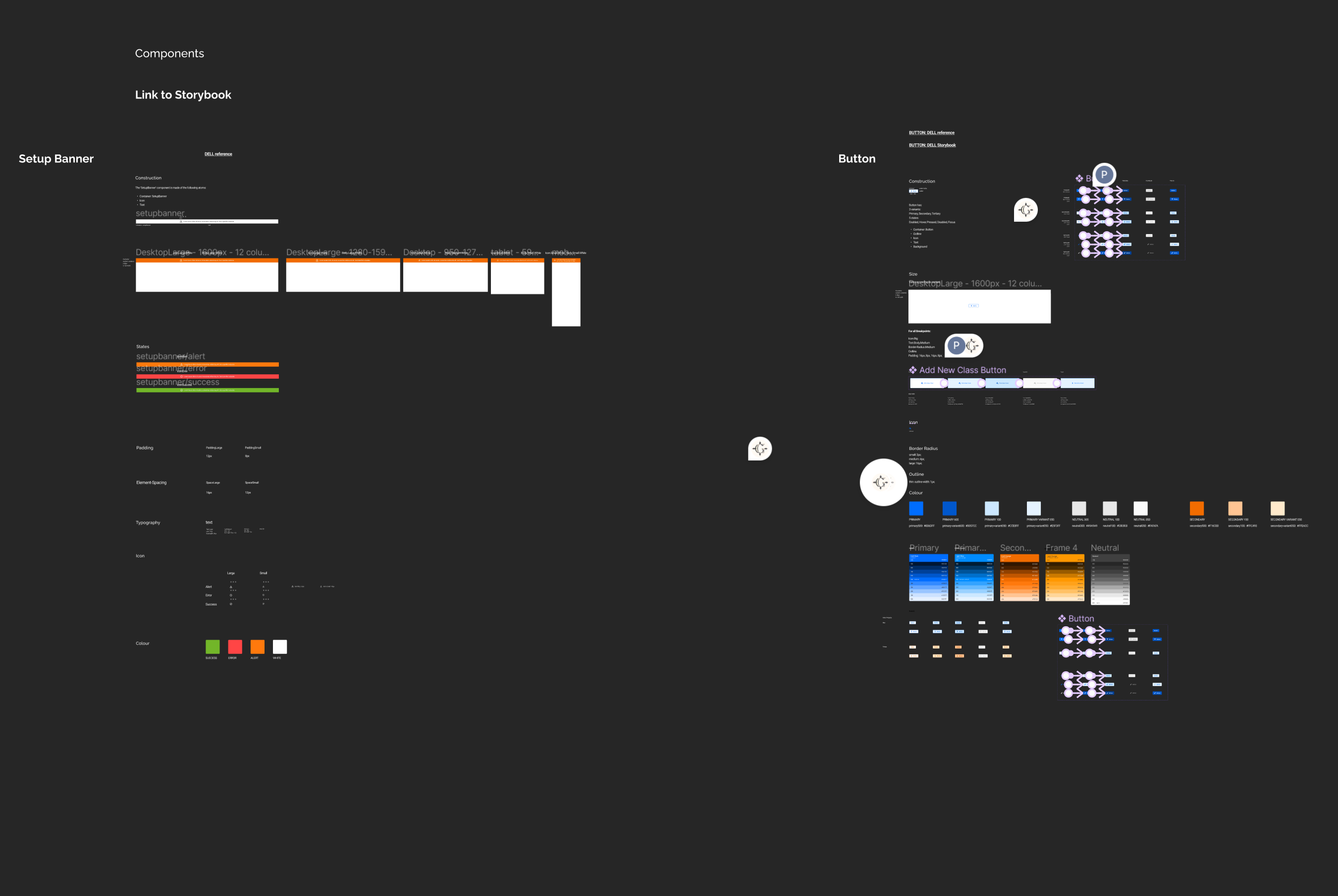
This part of the project also included revisiting our current Navigation Drawer – All these steps introducing new components to a design system that is currently too complex and need simplifcation, are now leading to a full redesign of our Design System, which will be part of a different project I will be sharing soon.
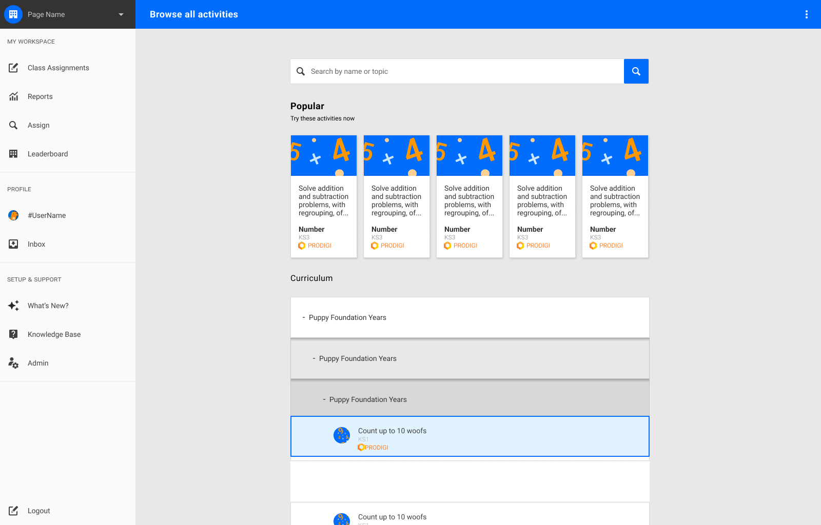
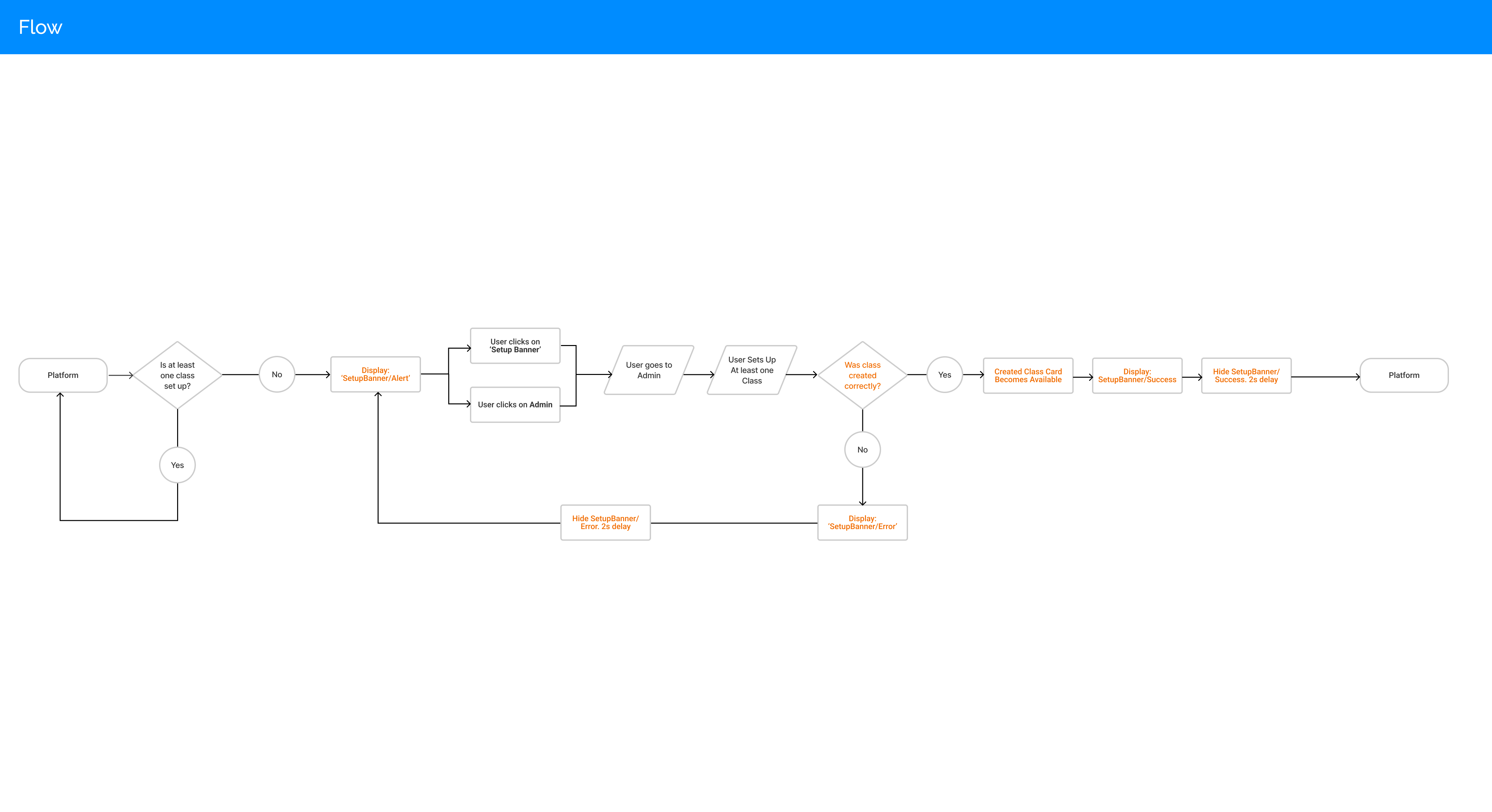
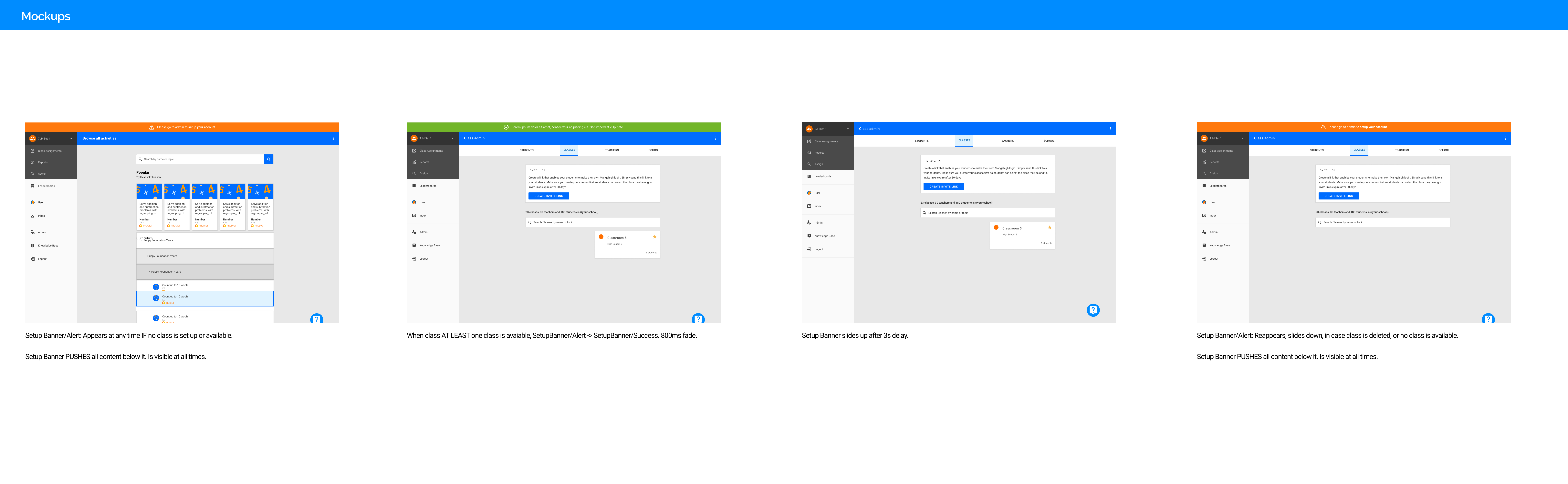
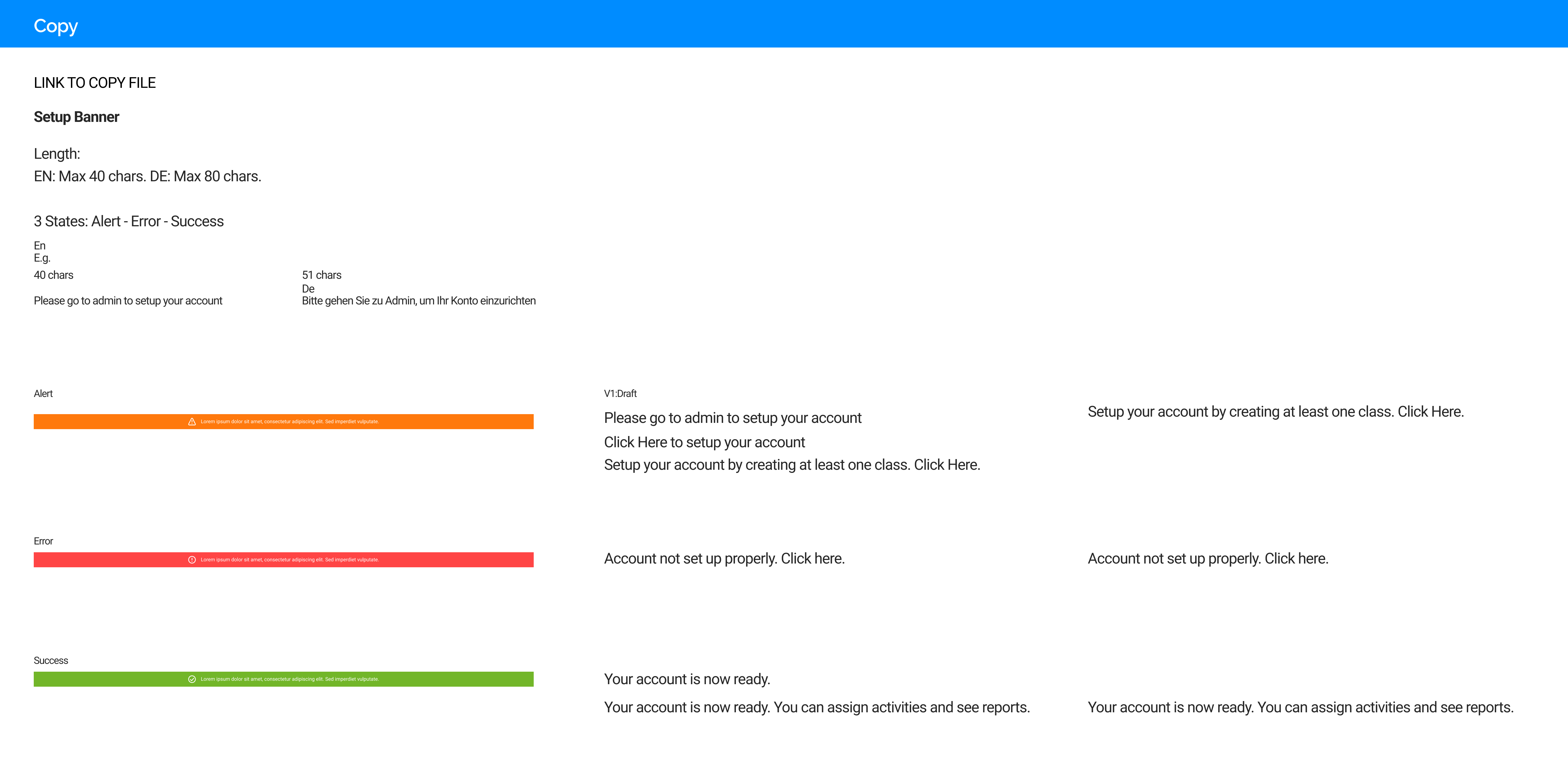
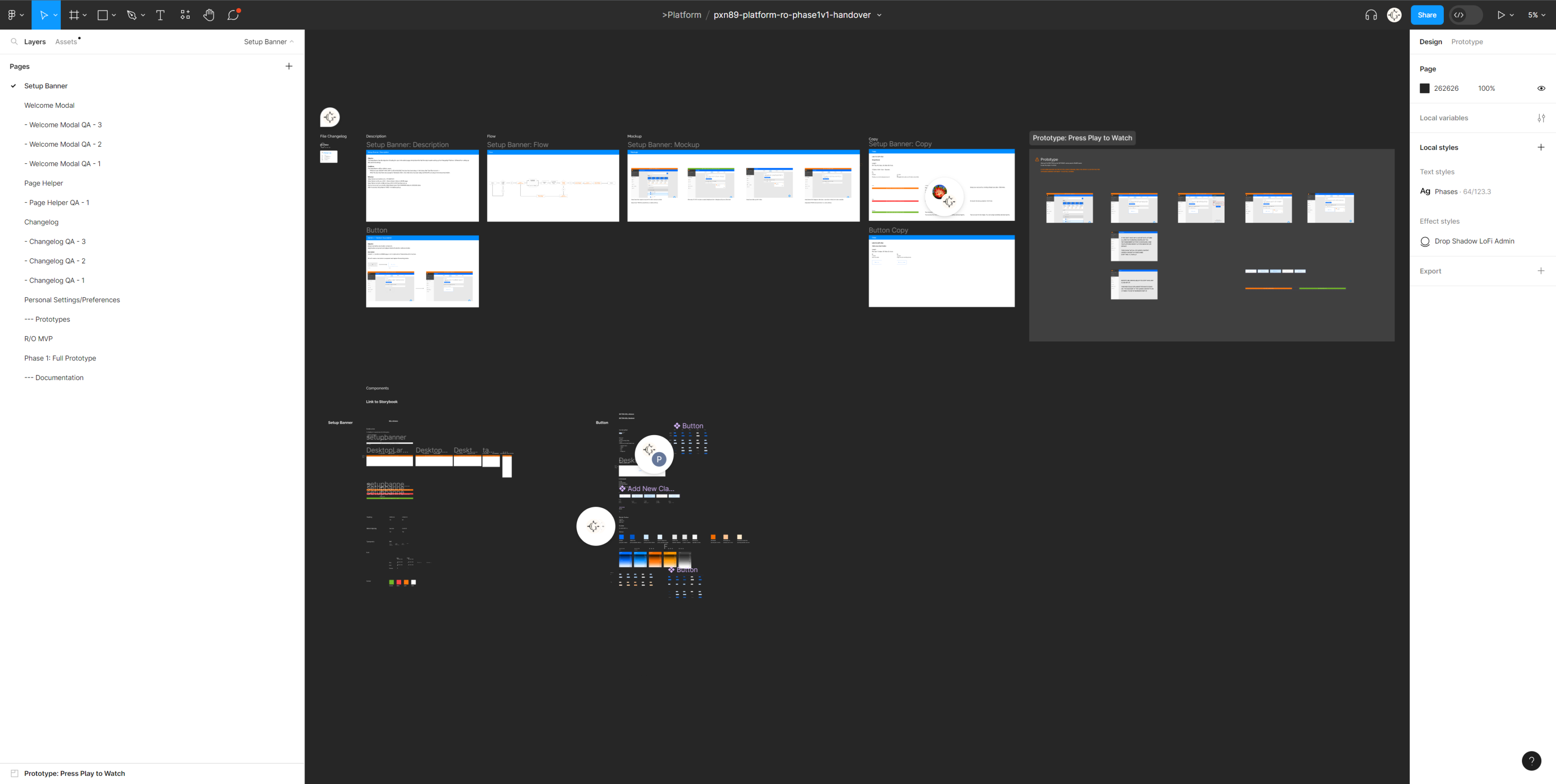
A top-banner kind of component was introduced, initially to guide users towards the first set-up stage of their teacher accounts.
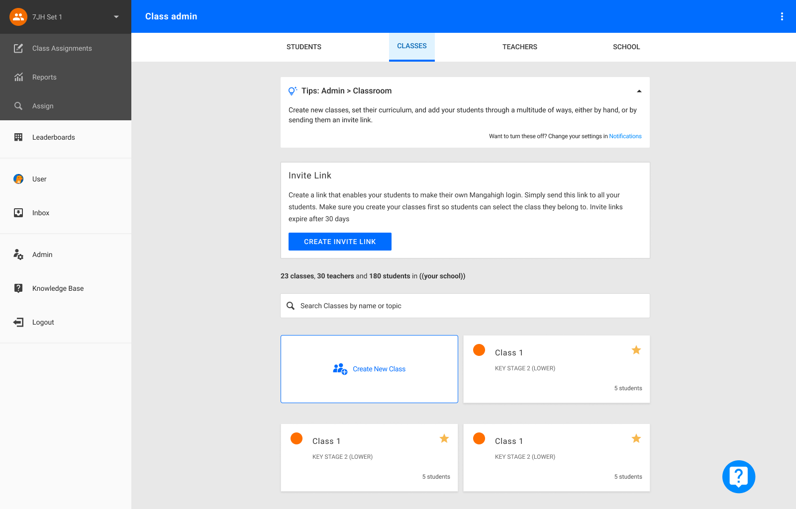
The objective of this feature is to help teachers create their first class by going to the Administration section of the platform.
The ‘Setup Banner’ top banner banishes once the user has finalised setting up their first class and added students to it.
A simple accordion type component that presents tips and instructions about the content of each page/section.
This feature was designed to help users navigate the platform more intuitively and avoid reliance on pdf documents or resorting to communicating with support – which is very resource demanding for the company.
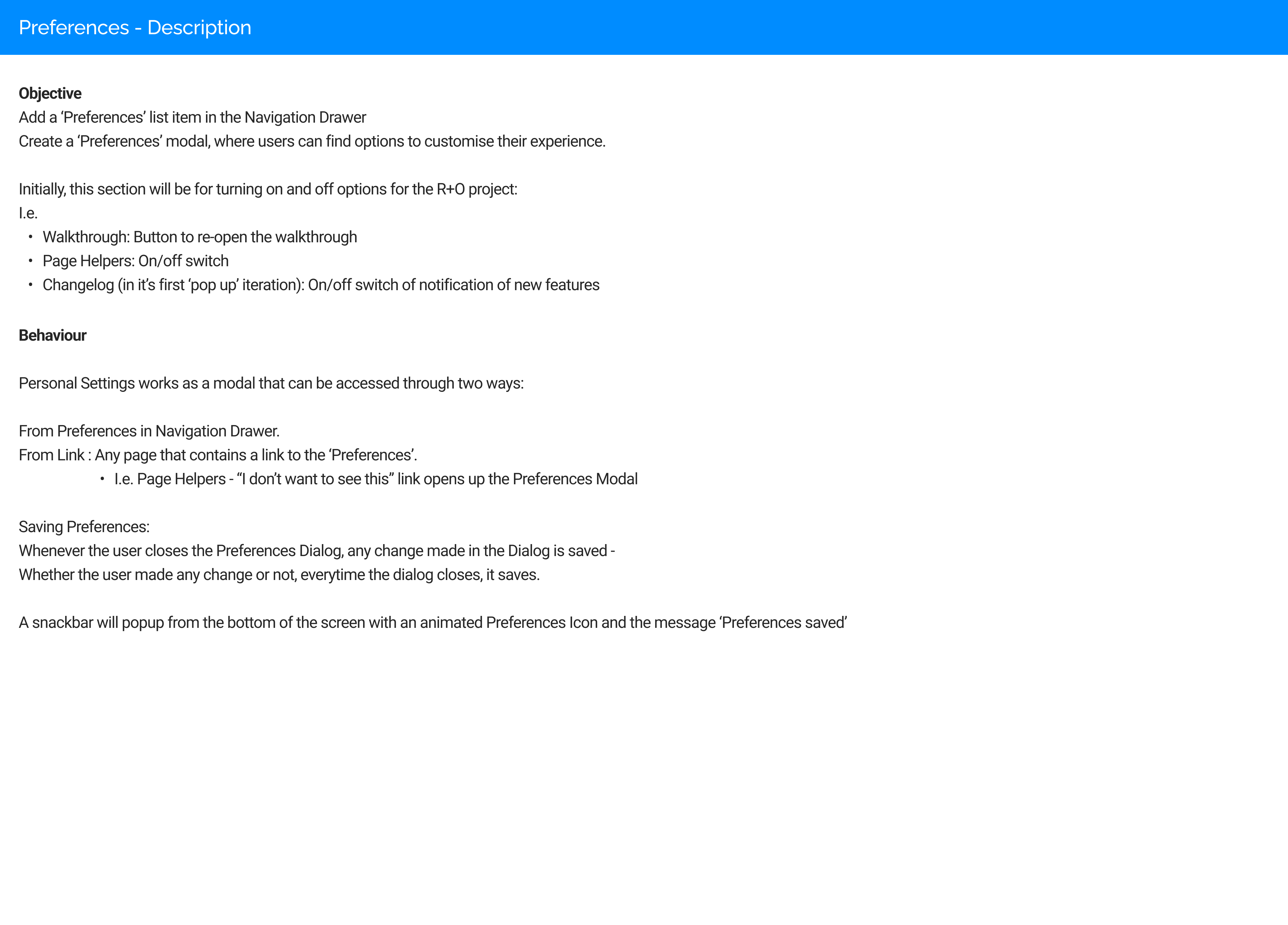
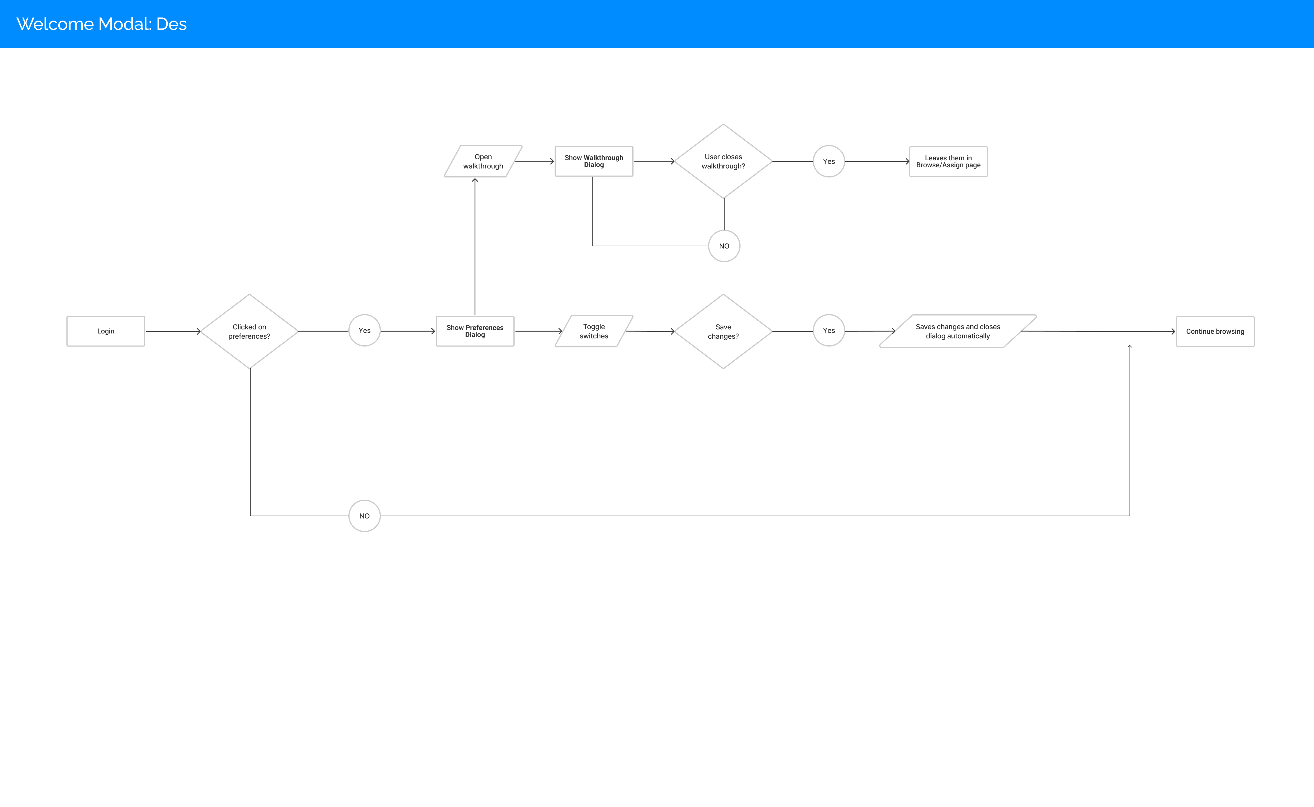
For the first time, and in line with the Personalisation aspect of the project, a ‘Personal Settings’ option was implemented.
This means that users will now have a space within the product to decide how they wish their experience to work.
Initially the features they will be able to toggle are basic in nature, but the concept includes potentially providing accessibility options and theming options, further enriching each users own preferences.
Figma Prototype
The full project prototype made in Figma, implementing all the design solutions developed during the synthesis stage.
You can interact with it in Full Screen by clicking the Full Screen button on the top right corner.
Each of the proposed features, once discussed thoroughly with each stakeholder and approved by VP of product, were developed by working directly with Back End and Front End developers, to understand the limitations and possibilities within the current infrastructure.
Before release, each feature produced would go through three phases of QA to ensure designs would be developed as according to technical specifications.
The handover process also evolved within the context of this project and became much more standardised, by revisiting how Handover documents were being produced in the past, and discussing with the developers involved what would be best practices that reduce friction in the understanding of design aspects of projects.
All documents, folder structures, naming conventions, briefs, and templates were revisited and guidelines were created for other designers to be able to follow process regardless of whether they were involved in the project or not.
Handover Process
Part of the project included DevOps and Project Management tasks such as redefining folder structures, naming conventions, file structures, design process: per file briefs, changelogs, specs, wireframes and mockups, prototypes, and design components – and revisiting the complete Handover process with Developers, to reduce production times + costs.
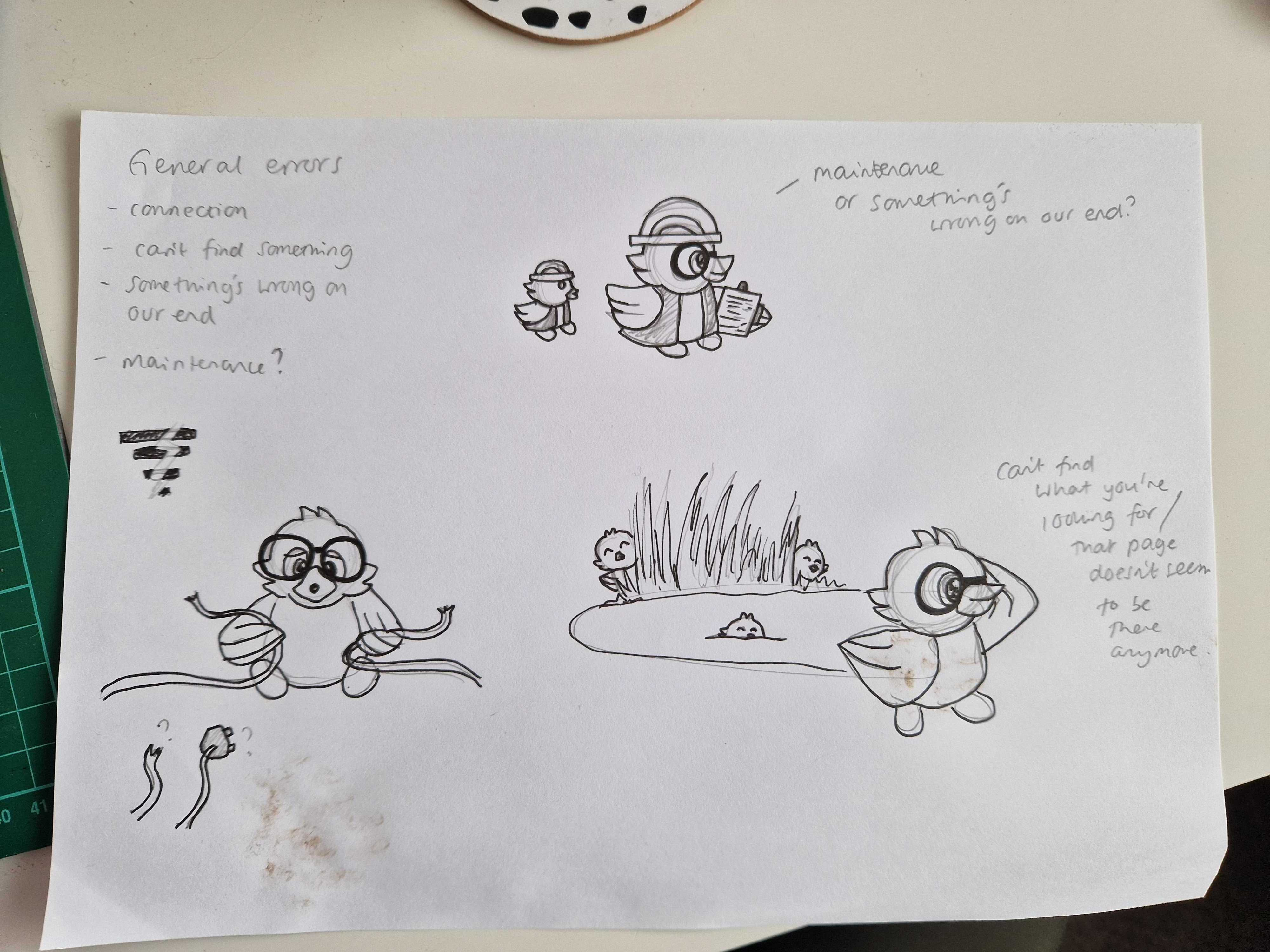
Error Messaging
Current error messages don’t provide meaningful call to actions or clear explanations of what to do in case something fails. They are also not branded.
Transparent, branded and meaningful error messaging for each section/page of the application is also planned for next iterations, making it easier for users to understand what to do in case anything goes wrong and softening the impact of issues.
Already in its third iteration, and with much more powerful components and features, the project has helped the company start providing a much more personalised experience for all users, as well as opening the door to a much more consistent design system, reducing production times and costs exponentially.
The next steps include reviewing the Login and Sign Up screens, which work as the main entrance door to Mangahigh’s product-
It is expected that by expanding actions across the scope of the project, MQL to SQL conversions will continue to increase thanks to providing a more satisfying, consistent and easy to use experience for all user.